
Enterprise License Management


Problem
The license management system was originally designed with much simpler requirements, but it quickly grew more complex and outgrew the original design. We had suspicions about where the pain points were, so we set out to validate them with users.
I conducted usability tests with a variety of user types, which revealed issues navigating between products and a license review screen that was difficult to parse. As a result, users frequently skipped the review step altogether.
The interface displayed all bundles and their products regardless of what had been purchased. This forced users to open every bundle to locate the products they actually needed to license, creating unnecessary friction.
We initially believed that hiding content behind accordions would simplify the interface. Instead, it forced users to open each section individually without improving the workflow.
Once on a product page, breadcrumbs were the only way to navigate back and select a different product. To address this, we added navigation buttons at the bottom of the form to move to the previous or next product. During usability testing, however, users often relied on the browser back button or clicked through every product until they found the one they needed.


Research & Wire Frames
The biggest challenge was improving navigation both when creating a license and when returning later to edit it.
I researched similar configuration-management workflows and created wireframes to prototype potential solutions and gather user feedback. Our goal was to involve users at every major design iteration to ensure we were aligning the experience with their needs.
The new designs focused on:
-
Showing users only the products relevant to the license they were configuring
-
Making it easy to move between products
-
Allowing users to deploy a license at any time during the process
When creating a new license, users first selected the product bundles they intended to license. This filtered out unselected bundles and products on the next page, allowing users to focus only on relevant items while still providing the option to reveal hidden bundles if needed.
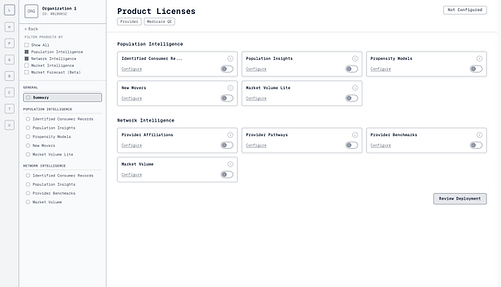
A summary page provided a high-level view of all products and their licensing status. A sub-navigation allowed users to see all products within a bundle and easily move between them, while still being able to review and deploy the license at any point.
Another key focus was improving the license review screen. Previously, the system displayed the entire license even if only a single setting had changed, which overwhelmed users.
In the new design, users could review only the changes they made while still having the option to view the full license if needed. This allowed users to quickly verify updates while also seeing the current state of any fields they modified.


Solution
The first iteration allowed administrators to create, edit, and review licenses without requiring assistance from engineering.
The next iteration focused on optimizing navigation, removing unnecessary or distracting information, and highlighting the elements most relevant to the task. These improvements allowed users to find and update licenses more efficiently.
By involving users throughout the design process, our team gained confidence that the final solution addressed real user needs and would improve the overall licensing workflow. Following release, the changes reduced licensing-related support tickets and increased completion of the license review step, indicating that users better understood and trusted the workflow.
Most importantly, the solution removed the need for engineering involvement in license configuration and dramatically improved onboarding efficiency, reducing customer onboarding time from two weeks to ten minutes.